AI Fundamentals
What Is Data Storytelling? Components, Process, and Examples

 Add Unite.AI to your preferred sources on Google

Data storytelling is the disciplined use of evidence, visual representation, and narrative structure to help an audience understand a finding and decide what to do next. It is not decoration added to a dashboard; it begins with a question, an audience, and a defensible chain from data to claim.
A strong story makes uncertainty and limitations visible. It guides attention without hiding inconvenient values, cherry-picking a scale, or implying causation from correlation. The goal is comprehension and accountable action, not persuasion at any cost.
Key takeaways
- Start with the decision and audience, then identify the evidence needed.
- Match the chart to the analytical task: comparison, distribution, trend, relationship, or composition.
- Use annotations and sequence to guide attention while preserving context and uncertainty.
- Test accessibility, source traceability, and whether readers can restate the conclusion accurately.
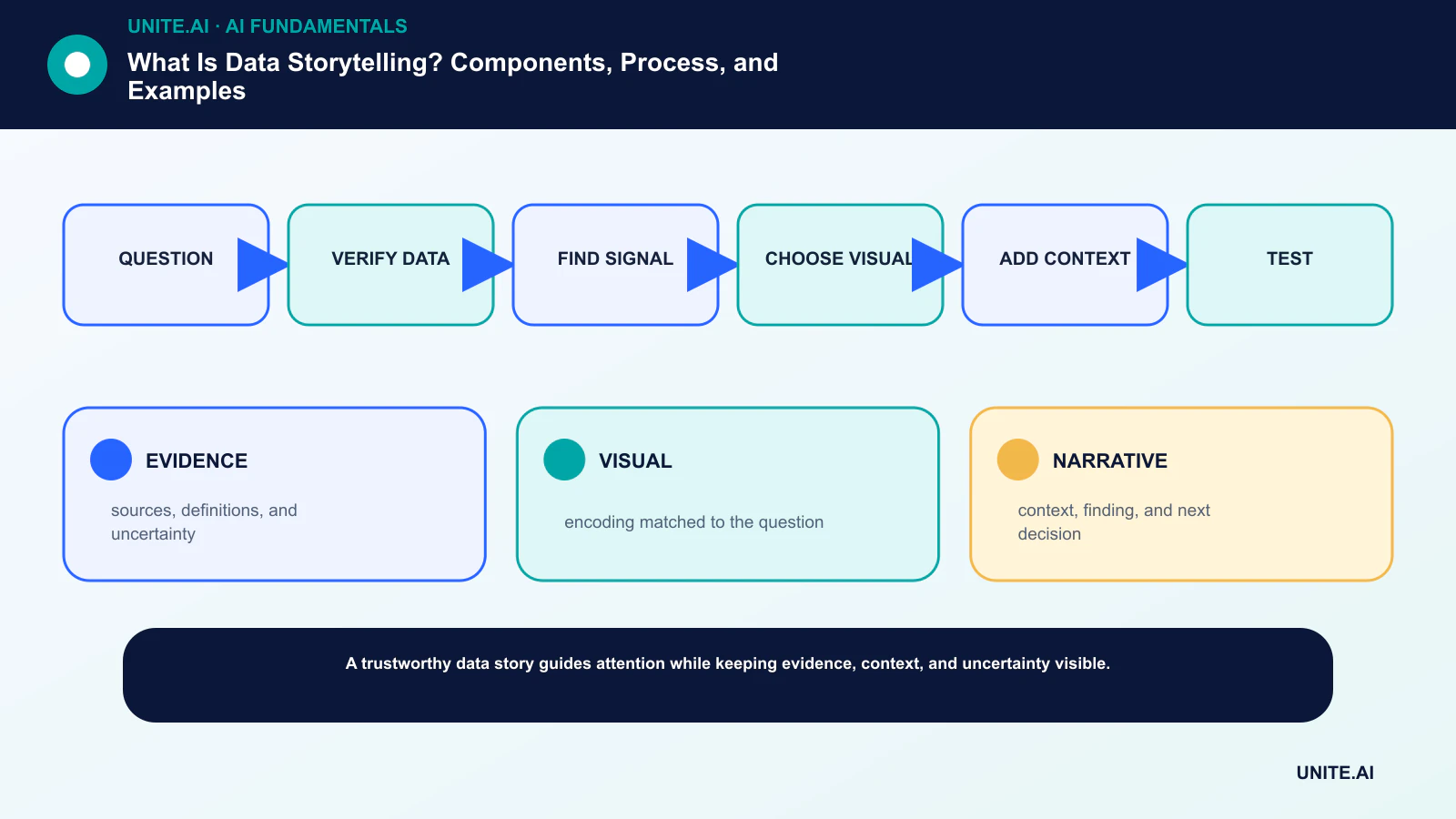
Evidence, visuals, and narrative
Evidence includes the data source, collection process, definitions, transformations, sample, and uncertainty. A visual maps selected variables to position, length, color, or shape. Narrative supplies order: context, question, finding, consequence, and next step.
The three components must agree. A compelling annotation cannot repair biased data, and a precise chart cannot answer a poorly framed question. Structured and unstructured data also require different preparation before they can support a comparable claim.
Build the story from a decision
Define what the audience controls and what would change its decision. Establish the baseline, comparison group, time window, and unit. Explore broadly, but separate exploratory analysis from the final explanatory view so surprising patterns are validated rather than merely selected.
Write the central claim in one sentence, then list the evidence that supports and challenges it. This prevents the slide sequence from becoming a tour of every available metric. Data science methods should remain inspectable behind the simplified presentation.
Choose honest visual encodings
Position and length usually support more accurate comparisons than area or color. Preserve meaningful zero baselines for bars, show denominators, avoid 3D distortion, and disclose filters. When values are uncertain, use intervals, ranges, scenarios, or distributions instead of false precision.
Use color sparingly and with sufficient contrast. Provide descriptive titles, alt text, table alternatives, and a reading order that works without color alone. These choices make the story more useful to people using assistive technology and often improve clarity for everyone.
Examples and evaluation
An operations story might move from a service-level objective, to a latency change, to the affected region, to a deploy correlation, and finally to the mitigation. A model story might show the task, baseline, subgroup errors, threshold trade-offs, and monitoring plan rather than one aggregate accuracy score.
Evaluate the story with real readers. Ask what conclusion they reached, what evidence they recall, what uncertainty they noticed, and what action they would take. If the message changes across audiences, revise the structure—not the facts.
The analytical chain behind the story
Every claim should trace through a chain: source observations, definitions, cleaning, transformations, analytical method, visual encoding, interpretation, and decision. Breaks in that chain are common. A rate without its denominator, a changed category definition, or a filtered time window can materially change the story while leaving the chart visually convincing.
Document provenance and transformations before polishing slides. Distinguish measured values from estimates and forecasts. For a model-derived metric, describe training data, validation, threshold, and uncertainty. For a survey, disclose population, sampling, response rate, question wording, weighting, and whether results are statistically or practically meaningful.
Causal language needs a causal design. A line that rises after a product launch may reflect seasonality, marketing, selection, or an external event. When the evidence is observational, write ‘associated with’ or ‘followed by’ and show competing explanations. The narrative should be no more certain than the analysis.
Visual grammar and narrative structure
Choose a visual based on the task. Bars compare magnitudes; lines emphasize change over ordered time; dot plots make close comparisons efficient; histograms and box plots show distributions; scatterplots reveal relationships; maps are justified when geography is part of the question. Pie and area encodings are difficult for precise comparison and should be used sparingly.
A useful sequence often moves from overview to evidence to detail: establish the baseline, reveal the change, isolate who or what is affected, explain drivers, quantify uncertainty, and state the decision. Annotations should point to data rather than replace it. Repetition in scale, color, and layout reduces cognitive switching between views.
Interactive stories should preserve orientation. Show current filters, provide reset, prevent accidental comparisons across inconsistent units, and make a shareable state. Tooltips are supplementary because they can be inaccessible and hide important context. A downloadable table supports audit and readers who need exact values.
Worked example and review checklist
Consider a customer-support story. Start with the service objective and total contact volume, then show resolution time by issue type and channel. Reveal that one product version accounts for the change, display the uncertainty and sample, connect it to a release, and propose a monitored fix. Avoid leading with a dramatic average that hides the mix shift.
Editorial review should ask whether the title states a fact or an interpretation, whether axes and baselines are honest, whether categories are complete, and whether colors imply an unsupported good-or-bad judgment. A domain reviewer checks meaning; a data reviewer checks calculations; an accessibility review checks contrast, descriptions, keyboard use, and reading order.
After publication, observe how people use the story. If readers remember an unsupported causal claim, focus on the wrong subgroup, or cannot identify the proposed action, the design failed even if every number was correct. Revision is part of data communication, not an admission that the original analysis lacked value.
Worked example: turning retention data into a decision
Imagine a product team sees monthly retention decline. The analyst first defines cohort, active use, observation window, exclusions, and whether the change is absolute or relative. The analysis separates acquisition channel, plan, geography, tenure, and product version, while checking missing events and instrumentation changes. A line chart alone is insufficient if a tracking migration created the apparent fall or if the aggregate hides stable retention within differently sized segments.
The story should state the decision, show the trustworthy baseline, reveal the most decision-relevant comparison, explain uncertainty, and connect the pattern to a testable hypothesis. An annotation can mark a pricing or onboarding change; a cohort heat map can show when behavior shifted. Avoid decorative 3D charts, truncated axes, or color scales that exaggerate small effects. Provide exact definitions and an accessible table for readers who cannot interpret the graphic.
End with options and consequences rather than a predetermined recommendation disguised as analysis. For example, propose an onboarding experiment with target segment, success metric, guardrail metrics, sample assumptions, duration, and owner. Publish the dashboard or notebook used to calculate the numbers, record data freshness, and monitor whether the decision improved retention. If later evidence contradicts the narrative, revise it visibly instead of preserving a compelling but obsolete story.
Practical implementation checklist
Turn the concept into a bounded, testable workflow: question → verify data → find signal → choose visual → add context → test. Name an accountable owner, document the data and dependencies, establish a simple baseline, set acceptance and stop criteria, test representative failures, and define monitoring, rollback, and review before expanding scope. Record versions and assumptions so another team can reproduce the result and understand what changed.
Before launch, run a documented readiness review with the people who build, operate, secure, and are affected by the system. Test normal cases, boundary conditions, dependency failures, and misuse; preserve the evidence and unresolved risks. Define who can approve release, change a threshold, override an output, or stop operation. Revisit the decision after real-world data arrives, because a technically successful pilot does not guarantee reliable performance at broader scale.
- EVIDENCE: sources, definitions, and uncertainty.
- VISUAL: encoding matched to the question.
- NARRATIVE: context, finding, and next decision.
Frequently asked questions
Is data storytelling the same as data visualization?
No. Visualization is one component. Data storytelling also includes audience, sequence, context, interpretation, uncertainty, and a decision or takeaway.
Can a dashboard tell a story?
Yes, if it supplies a clear analytical path and context while preserving exploration. A collection of unrelated charts is not automatically a story.
Primary references